Mid-Century Modern in Buenavista
Mid-Century Modern in Colonia Buenavista
To shoot House #4 in our Houses of Merida video series, we traveled to one of the colonias outside of the Centro. Colonia Buenavista was developed sometime in the 1950's. It is the colonia that also houses Trotter's Restaurant, Kentucky Fried Chicken and Burger King franchises and other important modern conveniences like automated carwashes and car dealerships. The houses in this area, while using many of the traditional materials also found in colonial homes, were built to reflect the modern designs that architects were creating around the world at that time. Rather than high ceilings and be-columned arches, these designs are full of low and wide rooms with lots horizontal planes. And many of these homes are not row-houses, like in the Centro, but set in the middle of larger plots of land, surrounded on four sides by high walls. The houses are built almost completely of cement block, with stone used for architectural interest, not as a building material. These houses already have pools, usually, and large gardens.
Frank Lloyd Wright-ish
The first thing you'll notice about this house is the entrance. Maybe it reminds you of Frank Lloyd Wright's Falling Water house, or if you're from California (like we are), maybe it reminds you of every fourth tract home in the San Fernando Valley built in the 1950's. This is not a bad thing, mind you, and when these houses are updated, like this one is, what was once looking a bit worn around the edges is transformed into something completely clean, new and 21st Century. Just look at the "before" photo of the entry way, and you'll see that the architect, Henry Ponce, didn't change much about it other than to refinish the front door, and clean and paint it.
This house is a four bedroom, five bath two-story home. Three of the bedrooms and bathrooms, including the one in the second story, have not yet been renovated. Downstairs, the renovated rooms include a living room, dining room, kitchen and master bedroom, all open on at least two sides with floor-to-ceiling windows that are either jalousie windows or sliding glass doors. There are two very large modern bathrooms, one for the master bath and one for the pool area. The owner also has a complete woodshop next to his covered carport (not shown in the video).
When we visited this house, we immediately fell in love with all the open doors. Every sliding glass door that could be opened was wide open, and breeze fluttered into every corner of the house. We didn't see a single screen or screen door in the house, nor did we see any mosquitoes. We did see a few birds and butterflies. And palms, bamboos, cacti and other greenery were visible from every room in the house.
Some of the floors in the renovated rooms still have the original pasta floor tiles. Other rooms, the dining room, kitchen and master bedroom, have large new grey ceramic tiles, which the owner noted look wonderful but are much more difficult to keep clean than the original floors. Ceilings are smooth and painted white, often with recessed areas containing modern fixtures where crystal chandeliers had originally hung.
Looking at the "before" photos of the house, it's easy to see how the "less is more" philosophy was applied here. Much of the clutter was removed. Built-in bookshelves were taken out. Iron-clad windows were replaced with sleek aluminum ones. And traditional elaborately-carved wood furniture was replaced with the clean lines of more modern examples. We don't have any "before" photos of the kitchen, but the owner told us that they removed a wall, and put in a large window above the sink and a huge sliding glass door on the other side of the room... completely opening up the space to the beautiful indoor/outdoor experience that it provides today.
Since the transformation of this house is only half done, you'll be able to see what the old windows and other details looked like, and how the modern finishes and window treatments have completely changed the character and tone of the building. Amazing what some new paint and stone floors can do to a place!
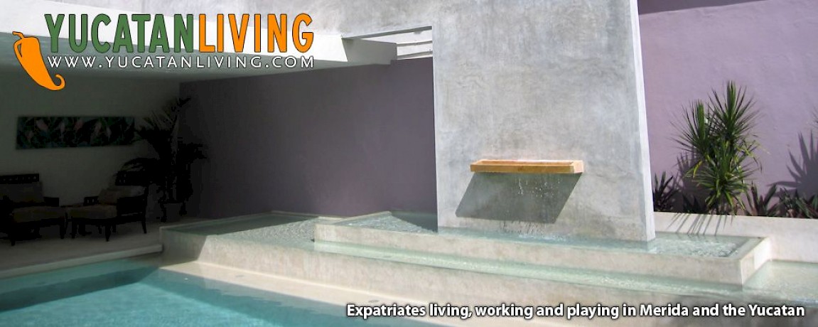
We especially loved the outdoor living areas here: the outdoor dining room, and the covered patios around the elegant pool. We can't wait to go back when the upstairs is done, the garden is filled in and the two guest rooms have also been updated. The house is beautiful now... it will be truly stunning when it is completely transformed!


Comments
Miguel Puig 15 years ago
Hi there!
I love your website. I am an architect who has been working in Montreal and also in the UK in cities like Nottingham, Oxford, Manchester and London. My and my wife are living in Merida now. I just finished doing some refurbishment work for myself of a 1950's house in "Alcala Martin" Neighbourhood, around the corner from the American Consulate. Even though I grew up here, it was very hard to deal with the people working for me during the construction of the house. There are no quality standards here and most of the workers did not care for detail. I finally achieved a 90% error-free house but now without sweating a lot and many moments of feeling hopeless... but it is done. I want to send you my blog so you can take a look at some photos, sadly there are no pictures of what the house looked like before.
Cheers!
Miguel
PS: My services are available to expats if you want an architect who speaks your own language and I mean not only an architect who speaks English but who understands you.
byebye!
Reply
Working Gringos 16 years ago
Actually, the owner of this house has a business doing cabinetry. He did his own kitchen and works for others as well. We are sure you could get the kitchen of your dreams from him directly here in Merida and not have to import anything.
Reply
Suzanne 16 years ago
That is the kitchen I WANT !!!!!!! Where would I find one in Merida?
I was thinking of importing a kitchen from Canada...but I don't know if it would stand up to the conditions in Merida. After reading the article on furniture I worry about termites and humidity. Any Ideas?
Who is that Henry Ponce?..sounds like every one is in love with him and I have become his biggest secret admirer. TALENT. ORIGINALITY. STYLE. CLASS are just a few of the words I would use to describe his work. Everything I have seen of his is fabulous whether it is colonial or modern.
I am just loving getting into the homes of Merida for a peek around. Thank you for such fun!
Reply
Jam Benitez 16 years ago
That great video, I love the house and as well distributed spaces, a hug
Reply
Susan 16 years ago
Those waterfall steps are simply amazing. What a fantastic home! Henry Ponce is such a talented and versatile architect. Although, my personal taste leans towards his classic colonial restorations, I admire his modern designs and his thoughtful eye for detail. The raised platform in the shower is a perfect example. I love how the water runs away from you, so you’re feet are never submerged while showering. And, the closet left me drooling – you just don’t see closets of substance in Merida. I can’t wait to see the update after the final renovation is complete!
Many thanks to YL & Eric Partney for another great video!
Reply
Laila and Per Holvöe 16 years ago
What a wonderful renovation!!!!! We like it a lot!!!!!
Reply
Spencer 16 years ago
Yes, I saw it when it was first purchased, when i said Wow!, a lot of work here.
Since then I have spent some amount of time here and yes it is wonderful, gets better each time i visit,i loved it so much bought a Casa of our own in Northern Merida!
Reply
John Venator 16 years ago
Wonderful example of a very sucessful renovation being done in stages! Loved the idea of the wall hiding the neighboring two story home!
The modern furniture was a real plus as far as keeping with thetheme of the wonderful renovation.
Reply
Cherie Pi 16 years ago
We appreciate your article and another terrific video in your impressive video series. How thrilling to use YOUTUBE to introduce the homes of Merida as well as some efforts of ex=pats! This is a win-win for Merida and her citizens, visitors, ex-pats, and the millions of potential YouTube viewers.
Henry Ponce is a multi-talented architect with colonial restorations and/or renovations as well as modern design. I agree with Patti that it was a joy to see a contemporary home. As current clients of Henry, we can happily state that he is a pleasure to work with, and frankly, an incredible human being.
Reply
fabio fortuna 16 years ago
disgusting! LOL (just kidding!)
this house is gorgeous of course! It has a very Scandinavian feel to it, - functionalism and clear lines - which i associate more with architects like Arne Jacobsen, more so than Lloyd Wright - personally, i lack the feel of Merida in this house, but it is a personal taste, since I moved to Merida for the architecture of the colonial houses.
Now I ' m looking forward to more 'affordable, humble homes' which were promised from house 5 on.....
Thanks again for this series!
Reply
Enrique De La Torre 16 years ago
Just about half of mile North of the Buena Vista Ave. is a small Fraccionamiento that remainsme a lot of Frank Lloyd Wrigt,cause I grew up in Terra Linda,Marin County California in a Valley of houses build by Him and to my surprise I found my self living on and off in a similar home but in Merida!!!You should check that neiborghoud it is very eclectic,any way good work>
Reply
(0 to 11 comments)Next »