Merida House Video: Affordable Modern
Click to watch the walkthrough on Vimeo!
Unexpected Facade
On a nondescript side street just off the main artery of Calle 59, one of the facades seems a bit out of place. We've lived in Merida for over eight years now, so we expect the rundown colonial facade with the peeling paint and the faint remembrance of rotulos (painted signs) past. We also expect the freshly painted colonial facade and glassed-in windows that signal "Look! A gringo lives here!". We even have come to expect the slightly rundown and sometimes weirdly configured cement block home a la Yucatan... a home with a lot of white-washed wrought iron, pastel-colored facade, low roof, louvered windows looking out to the street and maybe even, can you believe it? a lawn, possibly with a few green plaster frogs.
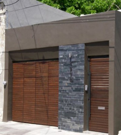
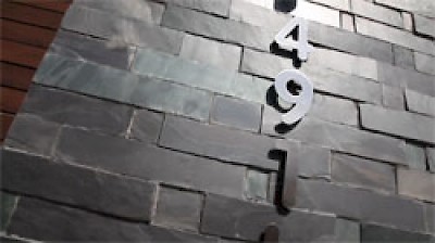
What we don't expect but found for this video is a facade that looks like this one: modern and sleek... a facade that could just as easily be on the upper East side of Manhattan or downtown Los Angeles. This facade has slate stone walls, wooden-slatted doors and sleek, stainless steel street numbers, setting it apart from just about every other facade in Merida, but certainly from all the others on its street.
And yet, this house is just a few blocks from both the Parque Centennario Zoo and Santiago Park. The owners took a typical mid-century modern home built here in the Fifties or Sixties (and painted pink, no less!) and turned it into something completely updated, modern and beautiful. And the best part of all of this is that they did it using local materials, local craftsmen and mostly local furniture.
MidCentury Modern Design
Another way this house sets itself apart is in its unique floor plan. The house is a duplex, designed from the beginning to have an upstairs one-bedroom apartment, and a downstairs two-bedroom house. Once you have closed that door behind you, you could be in Palm Springs or Miami but for a few clues here and there.
Most of the clues are in the furniture and some of the decorations (as well as, of course, the view of those old colonial buildings across the street...). We love how the owners took typical Yucatecan furniture and either recovered it with an unexpected fabric to look completely different or just put it in this environment, causing it to take on a whole new look. Here are a few examples.
The wooden chair to the left is a very typical design for this part of Mexico. You can see these wooden chairs in almost every used furniture store you go into, usually covered in some unattractive material or designed with rattan seating. By staining the wood dark and covering the upholstery with white leather, this chair (and its twin... there are two) suddenly became modern and charming. Other examples include the headboard in the guest bedroom and the bookshelf in the upstairs apartment, which are a typical bamboo design around here. Painting them stark white gave them a whole new look, and pairing them with modern sheet designs (in the case of the headboard) and a big Apple monitor (in the case of the bookshelf) made them look trés chic. The orange chair which is placed strategically in the foyer by the kitchen is the kind of plastic chair you might see in any cafeteria around the world, but here the color and shape provide a perfect counterpoint to the orange-painted recess in the wall and the grey cement and tiled kitchen beyond.
The outdoor chairs in the garden are a very typical Yucatecan type of chair, and nothing has been changed here. But surrounded by the modern furnishings of the home, and kept impeccably clean and neat, you would never know they are the same chairs that you can see parked out on a sidewalk somewhere in south Merida.
As you can see from the "before" photos above, the house was originally two-stories, but it was a one-family home. The new owners added a garage and a staircase in the front, creating separate entrances so that the upstairs is now a completely separate one-bedroom apartment that can be given to visitors or rented out as a vacation rental.
The building downstairs is divided into the main house and the casita, which contains the master bedroom and bath. The original casita looks nothing like the glass-walled modern building that we can see now, and is a testament to the imagination and skill of the owners. Separated from the main house by a covered patio, pool and garden, the master suite has both privacy and a lovely view of the greenery in the center. Can you believe those two photos (above and to the left) are of the same space?
From a rather small lot and an uninspiring cement-block house, the owners have created an incredibly liveable home for at least four people. They have also created an income-producing property, included a pool and a garage, and have completely updated the look to be something that you might easily find in an interior design magazine. Most of what was done was accomplished with local traditional materials, making creative use of colors and forms. They have made the most of the space that they had, strategically placing windows and doors for the maximum flow of light and air. They have paid attention to privacy needs, views and convenience, and ended up with a very comfortable living space in a great location at an affordable price. What more can we say? We were duly impressed!
Feedback Please!
We continue to welcome your comments and questions. Please let us know how we're doing and what you want to see more of, what other information would be useful and interesting to you. As always, the video says more than we ever can... so please click below and enjoy Yucatan Living's next episode of The Houses of Merida!
If you would like to share your house with the readers of Yucatan Living in a video, contact us at info@yucatanliving.com.
If you would like to be notified of just-published articles and videos on Yucatan Living, send us your email address at info@yucatanliving.com or enter it in the Subscribe button that is always hovering on the left side of your screen.
You can contact our host, Eric Partney of Mexico International Real Estate, at eric@mexintl.com


Comments
Brenda Thornton 15 years ago
This house is so lovely, and such good ideas were used in it. Personally, I would have kept the Master in the House and have put the visitor suite in the Casita, but everyone has differences in their likes.
Carrying the details through to the windows was delightful.
Once again, a wonderful and delightful article filled with innovative ideas for all of us.
Thank the owners for the additional information they provided about the size of the lot and their sources.
Reply
fabio fortuna 15 years ago
On the corner at Calle 41 and 64 they make cushions, repair chairs and remodel stuff with wonderful textiles. I suggest you take a look at that place. Some other ideas: San Damian seminuevo market in Colonia San Damian between Calle 38 and Calle 9. Also, try the mercado San Roque down south near the penal (jail) (sundays only). Another place might be on Avenida Tecnologico. You can find cast iron furniture and fixtures at Herreria Artistica Estella Duran on Calle 49 between 18 and 20 in Colonia Manuel Avila Camacho. Also stone work and beautiful maceteros (pots) in San Vicente Chuburna on Calle 23 between 30 x 32 (half price of those at Home Depot). I totally agree with the owners. Don't stick to centro! Drive around and stop when you see something interesting! I have a little motorbike and that is my hobby! Also, beautiful furniture in wood on Avenida Itzaes between 41 and 39 on the left hand side when driving north. Happy hunting!
Reply
Working Gringos 15 years ago
Hola Patti and Tray,
One of the owners of this house sent us some additional information you asked about. Here's what he had to say:
Although I designed the house myself we did use an architect to manage the construction for us... his name is Roger Gonzalez.
The lot is 6 by 36, although it widens to 7 metres around the terrace/pool area.
And for fabrics, I shopped all over the city! Parisina usually has something good though.....
And I can not remember the name of the vinyl place... I know how to get there though, it's on the avenida that takes you to City Center. I think most expats stick to centro for shopping, but most design/decor stores are out in the new northern colonias. I just spend a lot of time driving around and stopping when I see something interesting.
Hope that helps your readers...
Reply
CasiYucateco 15 years ago
More specifically on this house, it's really creative how old materials - like the pasta tile flooring - was used in this house to give a light, modern feel. The owners were very creative in changing the space to give a maximum of privacy, of light and air, and comfort for guests as well. The separation of the spaces for renters or guests is also ingenious. (I'd like a railing, being clumsy at times.) The traditional ojo de buey windows magically fit into the modern setting, with a little help from the pasta tile patterns. Really a fine job and on a modest budget (I imagine).
Reply
Tray 15 years ago
I really enjoy these segments on Yucatan Living. Eric, you do a wonderful job! I have had my home in Merida for several years now and have yet to discover where and how to obtain materials and craftsmen to accomplish some of these projects. It would be wonderful if Yucatan LIving could provide links to some of stores to find the fabrics and places that scan the patterns to make accessories. This is the best website for info on Merida. Thank you, thank you, thank you.
Reply
Patti 15 years ago
Would it be possible to list the architect and perhaps the lot size somewhere in the property information? I know that many people that read "The Houses Of Merida" are preparing to renovate, to some degree, and would find this information helpful.
Thank you.
Reply
CasiYucateco 15 years ago
This is a wonderful house, but I was hoping the next one would be Fabio's house. Or at least my shaky mind seemed to remember something about a video at Fabio's house. Is that coming up? Or am I just really and totally confused. (entirely possible)
Reply
Patti 15 years ago
I LOVE LOVE LOVE this house. It is simple and classic. The entry area is beautiful with the stairs leading up to the apartment. What a wonderful blending of the two spaces. Washer and dryer in the apartment is a great idea.
My husband and I just purchased a home in Merida and are planning our master as a separate unit detached from the main house.
Thank you again for all of your hard work.
Reply
alex 15 years ago
thank you for sharing such a wonderful home with the rest of us mortals!!
now, how affordable is it? this is exactly the type of home that i would like to have and i would appreciatte an estimate on the cost.
Thank you very much again!
Alejandro
Reply
fabio fortuna 15 years ago
Now HERE is a lot of creativity - obviously this is a great renovation. i get this 'calm, quite contemporary' feel and at the same time it shows it's Merida at it's best. there are many features i loved here. first: it really looks like 'a million dollars' at the same time it's the uniqueness and the creativity that gives that feel, not the money. my idea of countertops in the kitchen is exactly that: concrete with wooden doors, the backsplash is original and gorgeous and the pattern is repeated through the house with continuity - upstairs, in the bedrooms.....simple, relatively inexpensive, gorgeous, modern, and 'Merida-like'. :) i LOVED the pool area: building a pool in Merida is EXPENSIVE when it is 'in- ground' (as you hit rock at 2 ft depth) and unfortunately i know that by my own mistake. here it is 'avoided' by creating a back patio and stairs, it has almost a feeling of a middle-eastern 'iwan'. the duplex idea is great. we did the same thing in our home 2 years ago, independent efficiency unit with terrace. 'everybody' should do that....:) the furniture is creative - it has a 'scandinavian-ethnic' feel i am use to, and here in Merida you can really combine with used elements and a peek in the crazy store Triunfo to combine in million ways....i am a bit afraid of combining too many 'tiles and materials' (bathrooms) but here it works wonderfully.....
thanks, this is a great home
Reply
Carol 15 years ago
Wow- fabulous house!!
Reply
« Back (10 to 21 comments)Next »